Renko charts
cTrader Web fully supports Renko charts. In this article, we explain what a Renko chart is, how you can access Renko charts in cTrader Web and the key benefits Renko charts may offer to a trader.
How Renko charts are formed
In a conventional candlestick chart, new candlesticks are formed after a certain predetermined amount of time passes. In an h1 chart, for instance, a new candlestick appears every hour. As a result, a candlestick may represent wildly different price movements based on its open, close, high and low prices for a specific period.
In contrast, Renko charts consist of units (also known as bricks) that always represent fixed price movements. For instance, the following Renko chart has been constructed for BRENT with each brick representing a movement of 50 pips.
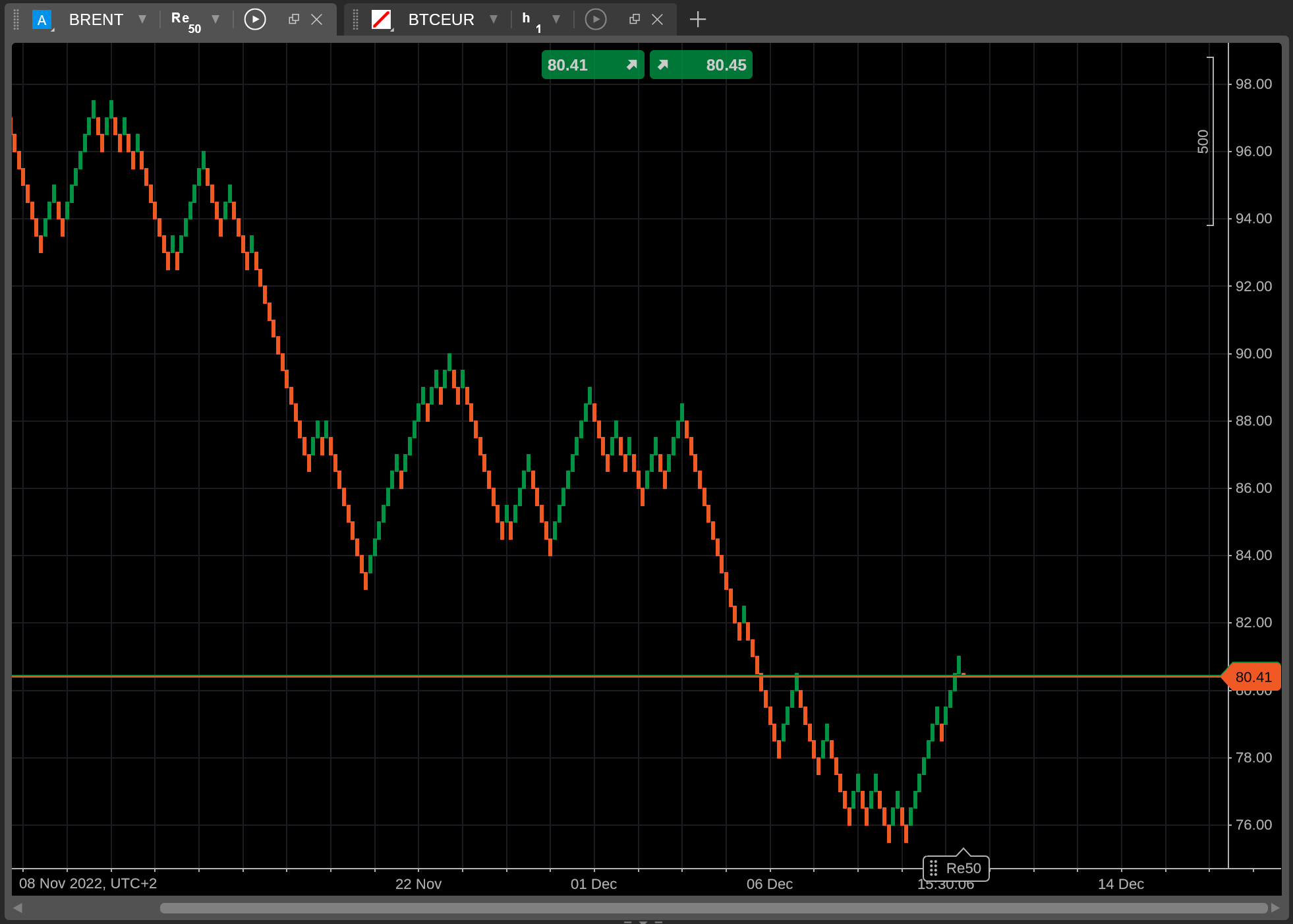
At first, Renko charts may be difficult to interpret. However, the process of how they are formed is simple.
- When a price movement exceeds a certain predefined number of pips (50 pips in the above example), a new brick is formed on the trading chart.
- The colour and direction of the new brick correspond to the direction of the price movement that generated it.
- If a price movement is insufficient to generate a new full brick, a partial brick will appear. It will dynamically respond to price movements until they exceed the specified pip threshold, after which the partial brick will be transformed into a full brick.
How Renko charts relate to periods
You may notice that time has no effect on how Renko charts are formed. In fact, in the screenshot above, you can see that the X-axis does not contain a uniform scale.

Instead of each unit representing an equal amount of time (30 minutes, 1 hour, 1 day, etc.), the X-axis in our Renko chart contains units that account for wildly different periods.
This effect occurs as Renko charts only form new bricks when price movements exceed a certain threshold. If a symbol is not making any significant moves in either direction, no new full bricks are formed, and, subsequently, the trading chart does not advance forward.
As a result, our BRENT chart is telling us that the symbol experienced some market volatility at the end of November. The period between November 22nd and December 1st (9 days) is represented by just four units on the X-axis. Note that the period between December 1st and December 6th (five days) is also represented by four units, meaning that price movements have slowed down a bit during this time as compared to the end of November.
This unique characteristic of Renko charts means that they can be used to effectively filter market noise. When looking at a Renko chart, you can be sure that each formation of bricks represents a market trend that merits some sort of reaction.
How to access Renko charts in cTrader Web
To generate a new Renko chart in cTrader Web, open the Chart selector menu by clicking the more button to the right of the Period selector.
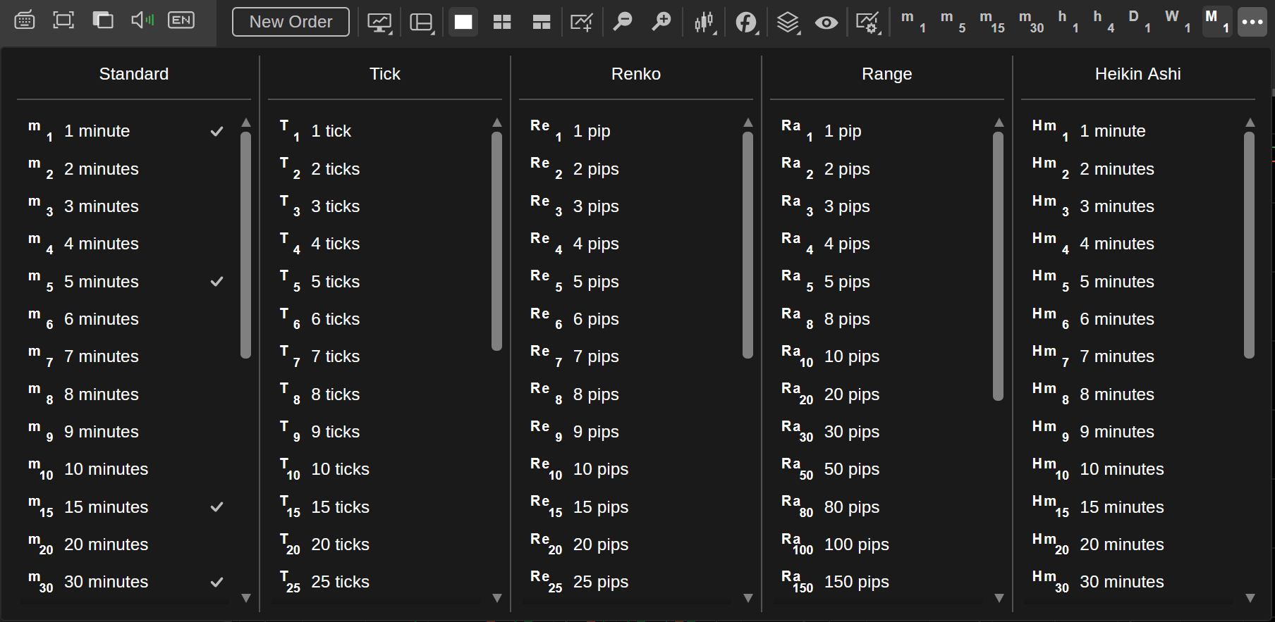
In the Chart selector menu, select a volume threshold in the Renko column. When doing so, keep in mind that the lower the chosen volume threshold, the quicker new full bricks will appear in a Renko chart.
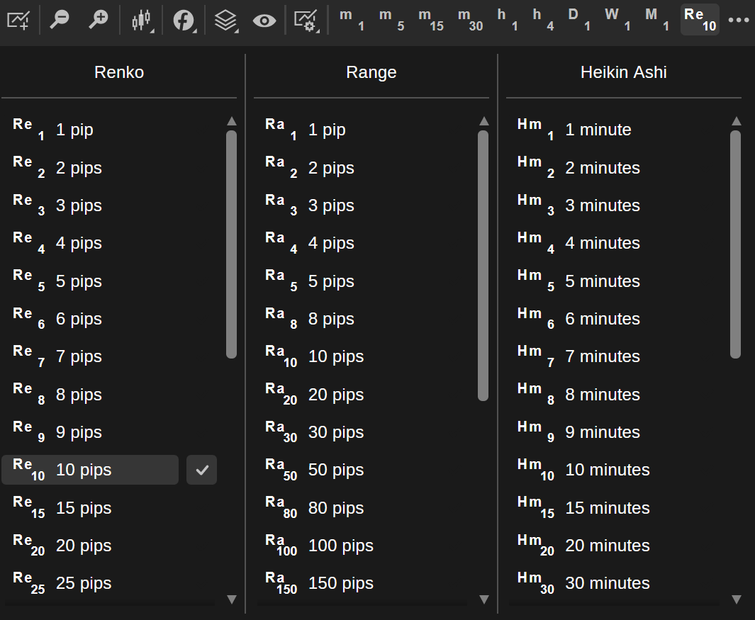
Hover over a specific volume threshold and check the Tick icon to its right to add it to your favourite periods. Afterwards, it will appear in the period selector as shown below.
After choosing a volume threshold, cTrader Web will generate the requested Renko chart for the currently selected symbol.
Note
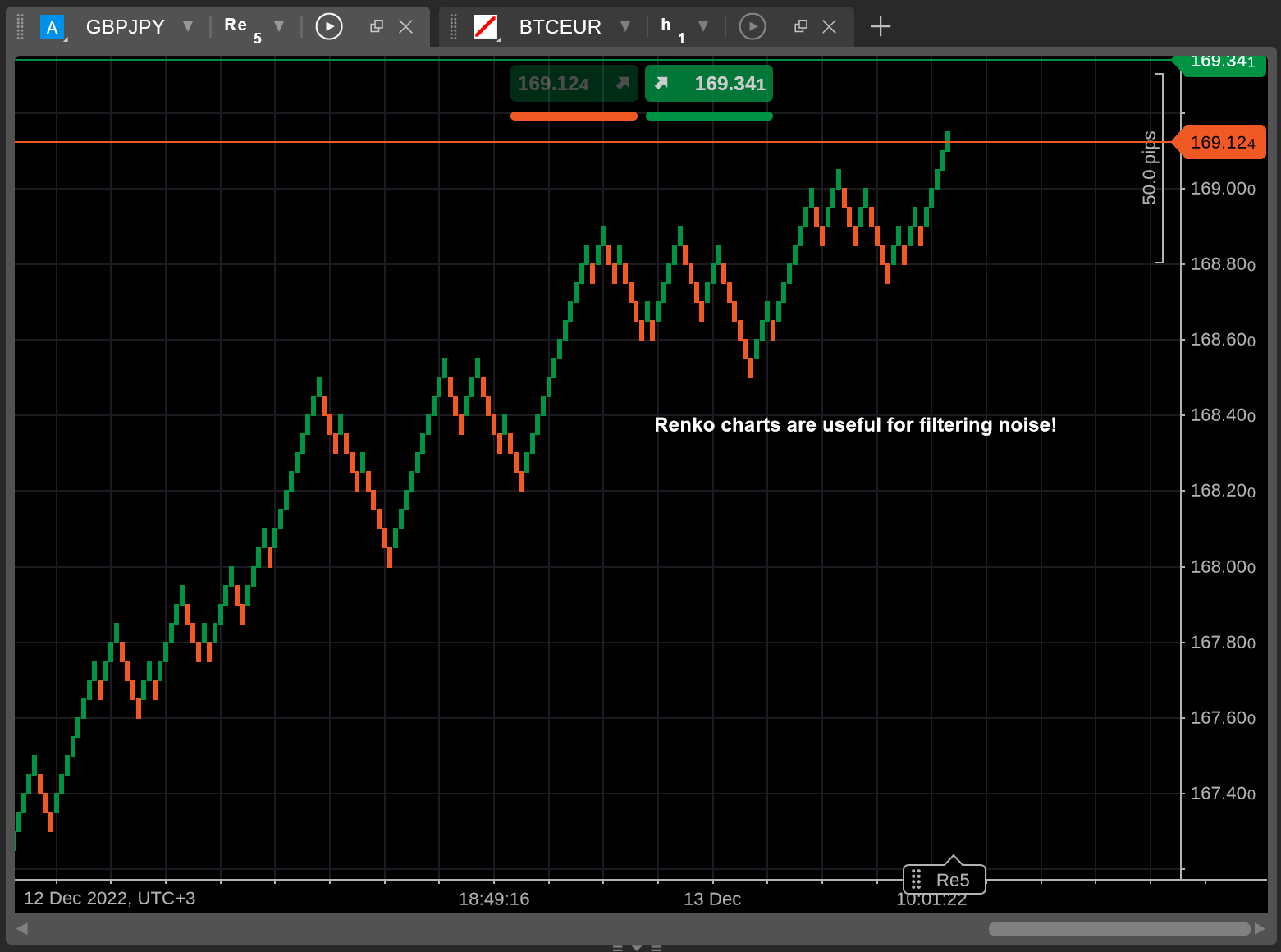
All the usual toolbox features provided by cTrader Web also apply to Renko charts. You can place horizontal or vertical lines, set up a price alert or take a Chartshot by pressing Ctrl + Shift + S.
In the screenshot below, we place custom text on the 5-pip Renko chart for GBPJPY.
Be mindful of the fact that volume-based indicators (such as the volume oscillator) cannot be plotted on Renko charts as Renko bricks do not account for volume.
How Renko charts benefit traders
Although Renko charts may be difficult to get used to, they offer several noticeable benefits.
- Renko charts provide clear, noise-free representations of market movements, making them ideal for detecting possible support and resistance levels.
- As Renko charts are not dependent on any specific periods, they can be useful to traders who want to focus on price trends.
- By eliminating visual clutter, Renko charts are crucial for determining the exact price points at which you should set your stop loss or take profit.
Note
For all their advantages, Renko charts may fail to demonstrate any clear price movements for relatively illiquid symbols or symbols that trade within a certain period range for a long period.
In brief, Renko charts are an incredibly useful addition to cTrader Web. By eliminating market noise, Renko charts can clearly demonstrate trend reversals and support and resistance levels. As a result, these charts can provide value both to new and experienced traders.