Bar chart
The bar chart is one of the basic chart types that provides the opening, closing, high and low prices for the selected period in the form of bars. Each bar shows how prices moved over a specified period. A daily bar chart (default for cTrader charts) shows a price bar for each day.
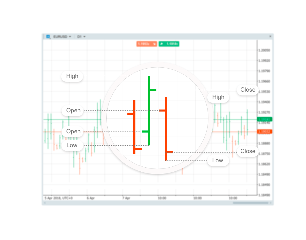
Each bar typically shows open, high, low and closing (OHLC) prices. This may be adjusted to show only the high, low and close (HLC chart in the chart type menu).
Technical analysts use bar charts to monitor price action, which aids in trading decisions. The bar chart allows traders to analyse trends, spot potential trend reversals and monitor volatility and price movements.
The increasing (bullish) bars in cTrader are displayed in green, while the decreasing (bearish) bars are in red.
Each bar on the bar chart has a vertical line that shows the highest and lowest price reached during the period.
The opening price is marked by a small horizontal line on the left of the vertical line, and the closing price is marked by a small horizontal line on the right of the vertical line.
Traders and investors decide which period they want to analyse. A 1-minute bar chart, which shows a new price bar each minute, would be useful for a day trader but not an investor.
A weekly bar chart, which shows a new bar for each week of price movement, may be appropriate for a long-term investor, but not so much for a day trader.
Interpret the bar chart
As a bar chart shows the open, high, low and closing price for each period, traders and investors can extract a lot of information from it. The first step in interpreting a bar chart is to identify the direction of the trend. Then look for signs that the trend is either strengthening or weakening.
Long vertical bars show there was a big price difference between the high and low of the period. That means volatility increased during that period. When a bar has very short vertical bars, it means there was little volatility. If there is a large distance between the open and close it means the price made a significant move. If the close is far above the open, it shows buyers were very active during the period, which may indicate more buying in future periods is forthcoming. If the close is very near the open, it shows there was not a lot of conviction in the price movement during the period.
The location of the close relative to the high and low may also provide valuable information. If an asset raised higher during the period, but the close was well below the high, that shows that towards the end of the period sellers came in. That is less bullish than if the asset closed near its high for the period.
Example
The example below shows a daily bar chart for XAUUSD in July 2020. During declines, the bars typically get longer, showing an increase in volatility.
Declines are also marked by more down (red) price bars compared to up (green) bars.
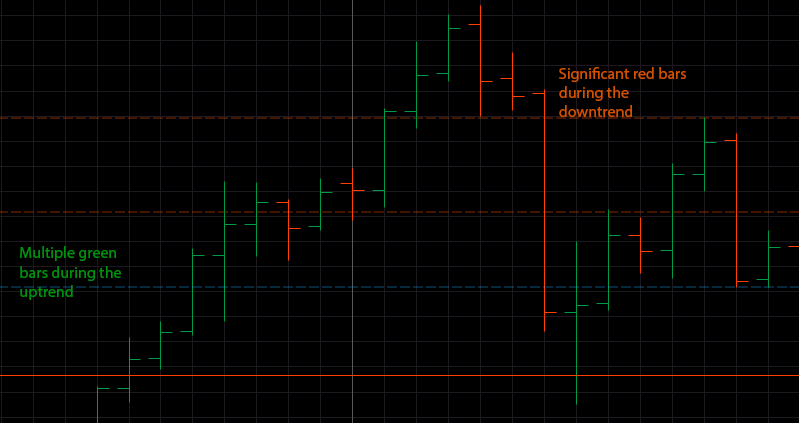
As the price rises, there are going to be more green bars than red bars. This helps to visually spot the trend. Even though there are typically red and green bars during an uptrend (or downtrend), one is more dominant. This is how prices move. In order for the price to move higher within an uptrend, the price bars will need to reflect that by moving higher as well, on average. If the price starts moving lower, on average, by creating more red bars, then the price is moving into a pullback or a trend reversal.