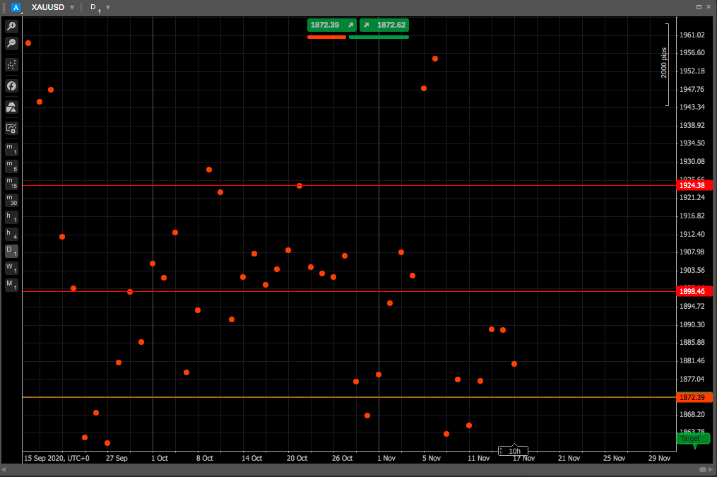
Dot chart
A dot chart (also known as a dot plot or strip plot) displays only the closing prices for the selected period as dots, just like the line chart but without connecting them.
This type of chart is used to graphically depict certain data trends or groupings. A dot chart is similar to a histogram as it displays the number of data points that fall into each category or value on the axis, thus showing the distribution of a set of data.
Dot charts are well known as the method that the U.S. Federal Reserve (Fed) uses to convey its benchmark federal funds interest rate outlook at certain Federal Open Market Committee (FOMC) meetings.
FOMC members place dots on the dot chart denoting their projections for future interest rates in subsequent years and in the longer run.
Principles of the dot chart
A dot chart visually groups the number of data points in a data set based on the value of each point. This gives a visual depiction of the distribution of the data, similar to a histogram or probability distribution function.
Dot charts allow a quick visual analysis of the data to detect the central tendency, dispersion, skewness and modality of the data.
Dot charts are typically arranged with one axis showing the range of values or categories along which the data points are grouped and a second axis showing the number of data points in each group. Dots may be stacked vertically or horizontally to show group counts for easy comparison. Dot charts work best for smaller data sets, as the number of dots can become less manageable with larger data sets.