HLC chart
The HLC chart visually presents the data series as a sequence of bars only showing the high, low and close (unlike OHLC bars that also show the open).
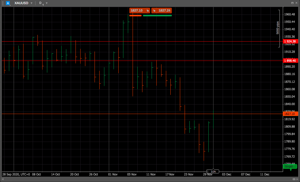
In cTrader charts, HLC bars display in green or red depending on the bar’s close in relation to the previous close. If the close is higher than the previous close, the bar is green. If it is lower, the bar is red.
A short horizontal bar drawn perpendicular to the high-low line indicates the closing price.
HLC was primarily the first step away from a simple line chart towards having more data to analyse. As the closing price is often seen as the most important, bar charts initially only showed the close.
Including the closing price with a horizontal bar helps visualise a line chart within the bar chart. A line connecting each closing bar would resemble a line chart. The HLC bar also shows how much the stock moved during the day.
A bar chart is more effective than a line chart for short-term analysis because it shows how much the stock price moved that day, something a line chart does not reveal. The movement in a stock reflects the level of momentum or trading pressure. A very short bar indicates little movement, suggesting that neither buyers nor sellers were influencing the price. This balance shows that neither side controlled the price. However, such equilibrium rarely lasts long.