Renko chart
A Renko chart is built using price movement rather than both price and standardised time intervals, as used in most charts. It is named after the Japanese word, renga, which means bricks, due to its brick-like appearance.
Each new brick is created when the price moves a specified amount, and each block is positioned at a 45-degree angle (up or down) to the prior brick. In cTrader, up bricks are green and down bricks are orange.
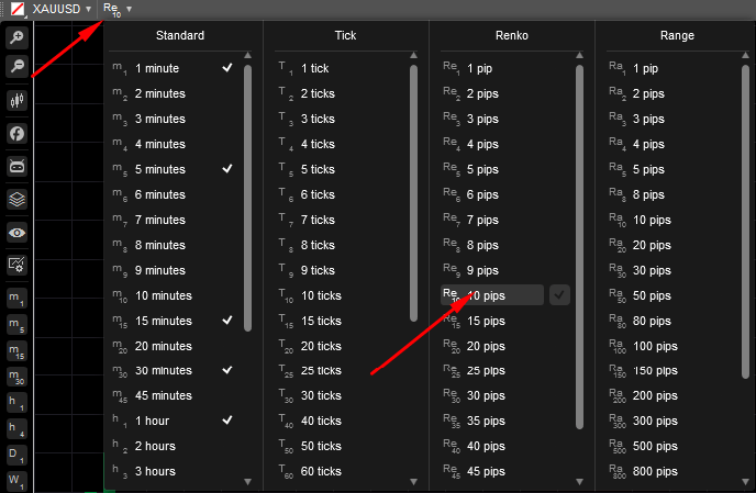
In cTrader, to display Renko bricks, select the period icon in the upper-left corner of the chart, then choose a value from 1 to 100 pips in the Renko section. Depending on your choice, your Renko chart will be built considering the respective number of pips.
Renko charts may have a similar look to Heikin Ashi in that both show sustained periods of up or down boxes that highlight the trend. However, while Renko charts use a fixed box amount, Heikin Ashi charts take an average of the open, high, low and close for the current and prior period. Therefore, the size of each box or candle is different and reflects the average price. Heikin Ashi charts are useful for highlighting trends in the same way that Renko charts are.
Renko charts filter out the insignificant price movements and focus on the trends. The flaw of such an approach is that some price information is lost due to the simple brick construction of Renko charts. Therefore, the first step in building a Renko chart is selecting the corresponding box size in pips.
Example
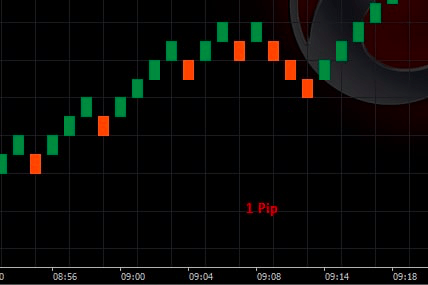
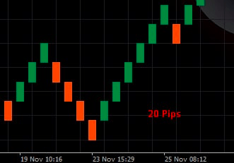
A trading symbol may have a 50-pip box size. In this case, a Renko chart will be built by placing a brick in the next column once the price has surpassed the top or bottom of the previous brick by the box size amount. 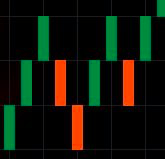
Renko charts are most useful for spotting trends, areas of support and resistance, breakouts and reversals. However, because of the basic price action nature of the Renko chart, traders often use indicators to provide additional information in their chart that either reinforce or warn against buy and sell signals.
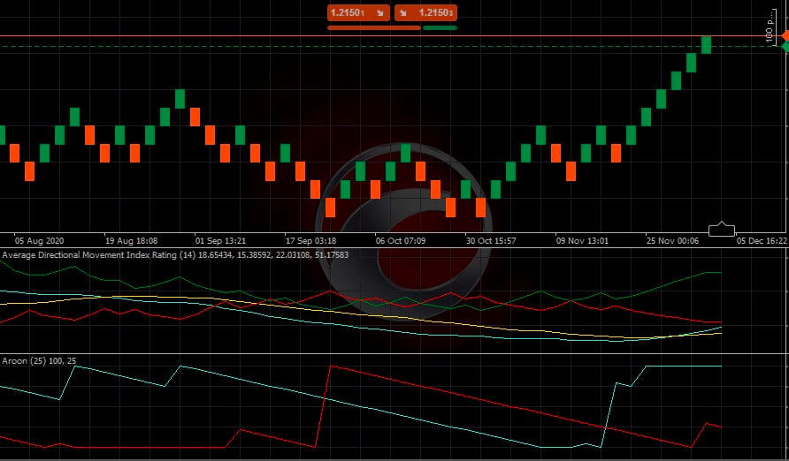
cTrader charts have many preset trend indicators to use on charts, like the Average Directional Movement Index Rating, a variety of moving average indicators and more. Check this section for more information on indicators and how to use them.
Note
Despite Renko charts showing a time axis, the time intervals are not fixed. One brick could take months to form, while several bricks may form within a day. This varies from candlestick or bar charts where a new candle or bar forms at specific time intervals.
When you change the Renko brick size, the smoothness of the chart changes. Reducing the box size (fewer pips) creates more swings and highlights potential price reversals earlier.
A larger box size (bigger pips amount) will reduce the number of swings and noise but will be slower to signal a price reversal.
Due to less noise compared to candlestick charts, Renko charts are effective in identifying support and resistance levels. When a strong trend forms, a Renko chart allows riding that trend for a long period before even one brick in the opposite direction forms.
In Renko charts, trading signals are generated when the direction of the trend changes and the brick that is being built changes its colour.
Example
A trader might sell the asset when an orange box appears after a series of climbing green boxes. Otherwise, if the overall trend is up (many green boxes) a trader may enter a long position when an orange brick occurs after one or two orange boxes (a pullback). 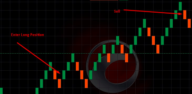
Flaws
Despite their advantages, Renko charts show fewer details than candlestick or bar charts because they handle time differently.
A symbol that has been ranging for a long time may be represented with a single box, which does not convey everything that occurred during that period. This may be beneficial for some traders and for many cases, but not for all.
As mentioned earlier, Renko charts ignore highs and lows, only closing prices are applied. That is why a lot of price data is left out since high and low prices can vary greatly from closing prices. The use of only closing prices reduces the extra noise, but it also means the price could break significantly before a new box forms, and it could be too late to get out with a manageable loss.
Therefore, when using Renko charts, the good practice is to use stop-loss orders at fixed prices.
Example
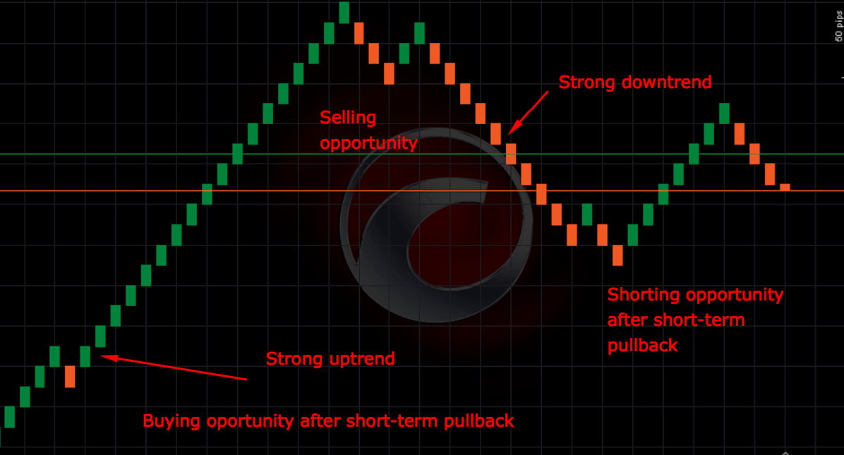
The chart below shows a strong uptrend in a symbol with the 10-pip box size. Boxes are drawn based on closing prices, so highs and lows, as well as moves smaller than 10 pips, are ignored.
There is a brief pullback, marked by an orange box, but then the green boxes emerge again. Given the strong uptrend, this shows an opportunity to open a long position. Consider an exit when another orange (down) box forms.
After the uptrend, a strong downtrend forms. A similar tactic could be used to open a short position. Wait for a pullback marked by the green (up) box.
When an orange (down) brick forms, enter a short position, as the price could be heading lower again in alignment with the longer-term downtrend. Exit when a green (up) brick occurs.
These are sample guidelines, but note that sometimes you should see two or more bricks in a particular direction before deciding to enter or exit.