MACD Histogram
Definition
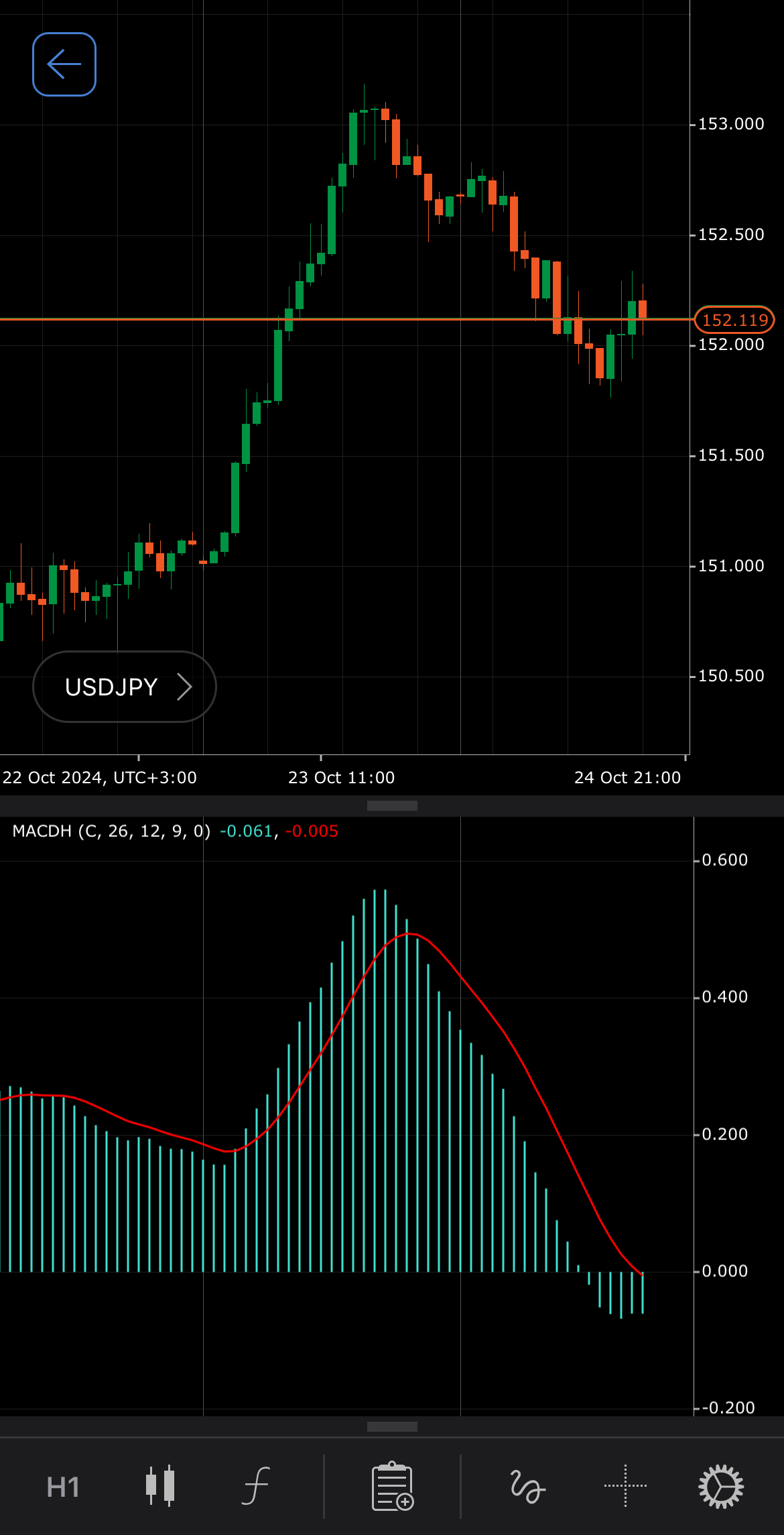
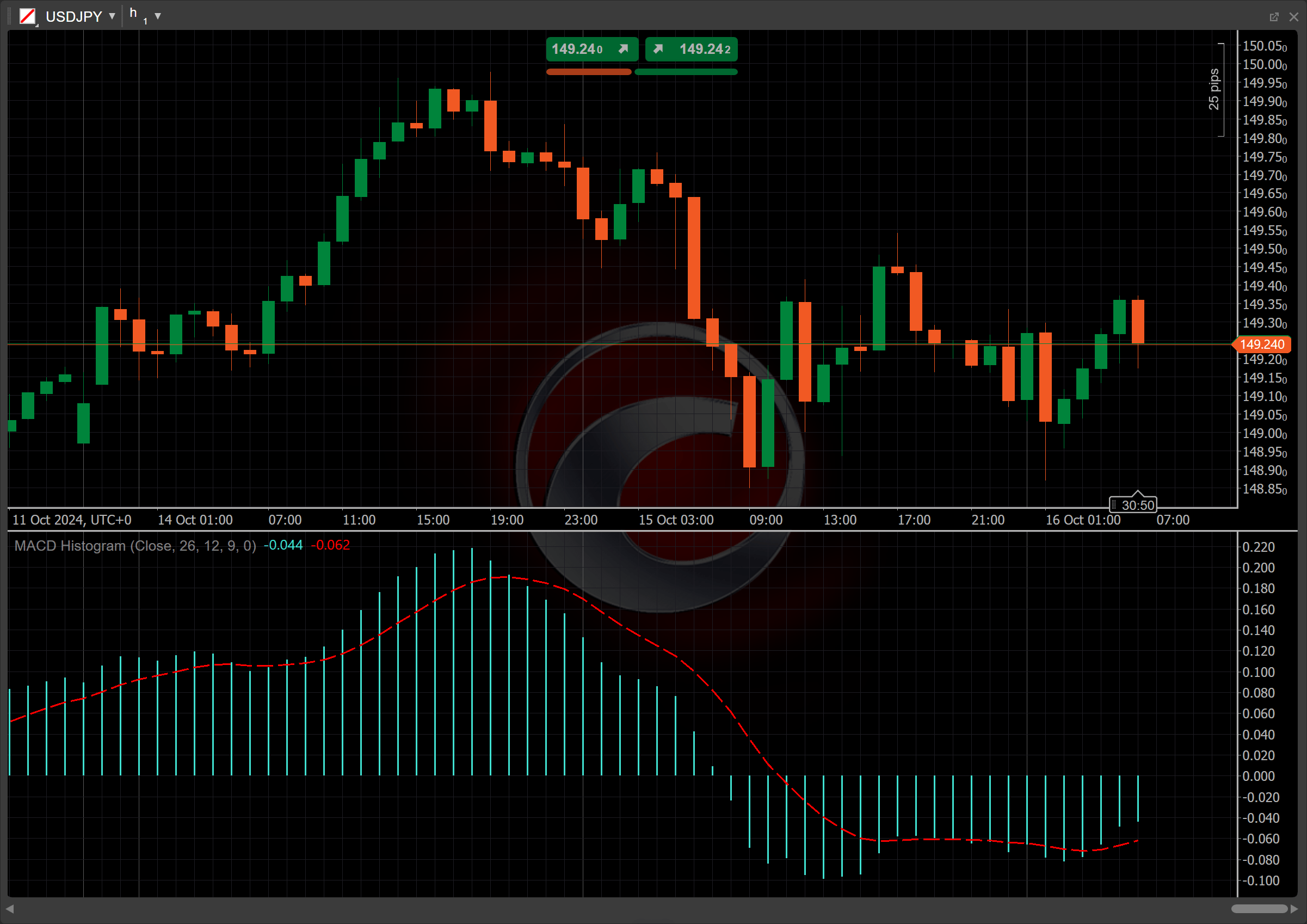
The Moving Average Convergence/Divergence (MACD) Histogram is an auxiliary trend-following momentum indicator designed to help identify price trends, measure trend momentum and identify entry points for buying or selling. Displayed as a bar graph, the MACD Histogram visualises the difference between two Exponential Moving Averages (EMAs) of a symbol price and is commonly used for clear visualisation of momentum shifts.


History
The MACD was created in the 1970s by Gerald Appel and has become one of the most widely used technical tools, easily accessible on most trading platforms provided by online stock brokers. It aimed to identify changes in the intensity, direction, momentum and duration of a stock price trend. In this specific configuration, the MACD Histogram represented by bars instead of a continuous line, makes momentum shifts and crossovers more visually prominent and easier to interpret.
Calculations
The MACD Histogram is determined by subtracting the long-term EMA from the short-term EMA:
\[ MACD = { EMA_{ShortCycle} - EMA_{LongCycle} } \]
\(ShortCycle\) – the shorter period for the fast EMA
\(LongCycle\) – the longer period for the slow EMA
Interpretation
The MACD Histogram is most commonly used with a 12-day period for the short-term EMA and a 26-day period for the long-term EMA. Each bar reflects the value of the MACD indicator itself, while the main patterns of the MACD Histogram behaviour can be interpreted as follows:
-
Zero-line crossovers – positive bars indicate that the short-term EMA is higher than the long-term EMA, suggesting upward momentum, while negative bars indicate the opposite, pointing to downward momentum.
-
Crossovers – when the MACD Histogram turns upward, crossing over the Signal line, and continues or stays above it, a bullish crossover has occurred. When the MACD Histogram crosses down over the Signal line, this is a bearish crossover. Crossovers are more reliable when they conform to the prevailing trend.
-
Rising and falling – the rising bars indicate strengthening momentum, signalling increasing trend strength. Conversely, falling bars suggest weakening momentum, potentially signalling a trend reversal or slowdown.
-
Divergence – when the histogram shows shrinking or growing bars while the price continues moving in one direction, it could signal potential trend reversals, making divergences more apparent. An increasing divergence between the histogram and the Signal line suggests strengthening momentum in the current trend, signalling that the trend is likely to continue.
Application
-
Buy signal – consider placing a buy order when the MACD Histogram bars cross from negative to positive, indicating a shift from bearish to bullish momentum. This suggests the start of an upward trend.
-
Sell signal – consider placing a sell order when the MACD Histogram bars move from positive to negative, signalling a transition from bullish to bearish momentum and the potential beginning of a downtrend.
-
Stop-loss placement – for buy signals, traders typically place a stop loss just below the recent support level, while for sell signals, a stop loss is set just above the most recent resistance level. This helps minimise risk if the trade moves against the signal.
-
Confirming trades – traders often use additional indicators such as the Relative Strength Index (RSI), moving averages or trend lines to confirm the histogram signals. For instance, when confirming the MACD bar signals, traders usually look for the RSI above 50 for buy signals or below 50 for sell signals. Additionally, ensure the price respects a trend line, breaking upward for buys or downward for sells, to strengthen conviction.
Note
You can take advantage of algo trading, with cBots executing trades based on the signals from this indicator, as shown in our examples. Learn more about how to use indicators in cBots.
Limitations
The MACD Histogram can produce delayed signals, meaning traders might enter or exit positions after the price has already moved significantly. As price momentum decreases, the Histogram tends to drift toward the zero line, even if no actual reversal is occurring. However, the histogram format is useful for tracking the strength of momentum. Traders can easily gauge how quickly momentum is accelerating or decelerating by observing the rapid growth or shrinkage of the bars, which can assist with timing entries and exits.
Summary
The MACD Histogram reflects the momentum of price changes over time and is frequently used to enhance the visualisation of momentum shifts. Rising bars indicate increasing bullish momentum, suggesting the potential for upward price movement, while falling bars signal bearish momentum, indicating possible downward price movement. The height of the bars provides insight into the strength of this momentum: taller bars represent stronger momentum, and shorter bars indicate weakening momentum. By analysing these bars, traders can better time their entries and exits, assessing how quickly momentum is shifting in the market.